When I was a kid, an amazing idea to make a bird feeder landed in my head. The whole week I was crafting the luxurious birdhouse and after it was ready proudly brought it outdoors.
Good birds are not gifted with speech — I can only guess their thoughts when they tried to get inside without any luck. In the end, the feeder collapsed as it was beautiful yet inapt for real life.
I learned my lesson: before materializing any astonishing idea from your head, test it first. Or, to speak Customer Development language, don’t neglect the Idea Validation Stage. Build the Minimum Viable Product first and throw it into the real world (via a startup landing page) to see how the real world will react on it.
WHY THE HECK I NEED TO VALIDATE THE IDEA
42% of startups fail because they didn’t get their product/market fit right.
Seems this 42 % are not the best companies, agree? It’s a common delusion when owners trust their “gut feeling” too much and believe their product will blow up the market after the release.
Tom Zaragoza, a former CEO of Gymlisted startup confesses why his startup failed after 8 months of hard work:
“We made the huge mistake of not validating early on the base idea behind Gymlisted. Before building out a full-on platform, you should build the simplest version of your idea and validate it early speaking with potential users.”
The stage of MVP validation will help you understand how your customers will actually use the product and what you can add to stabilize its features.
There’s one tried and tested approach to get to know your customers better and validate your value proposition and pricing: by building a startup landing page.
IS YOUR PRODUCT APT TO REAL LIFE? A STARTUP LANDING PAGE WILL TELL YA THE TRUTH
Before building a startup landing page to validate your MVP, there’s an important question you need to answer: WHY?
Simon Sinek, a famous motivational speaker, and marketing consultant, emphasizes on finding a WHY for your business:
“People don’t buy what you do, they buy why you do it”
Ask yourself: “Why does your company exist other than to make money?” This bunch of questions has to help you:
- Why have you created the company?
- What problem are you trying to solve?
- Why does this problem exist?
Just identifying the problem is not enough. The Lean Startup’s suggestion to “fall in love with your customer’s problem” is no joke. Your product should be a magic potion that will cure customer’s pain points whenever they arise, and your value proposition should leave no ambiguity about what people will get with your product.
QUESTIONS TO ASK YOURSELF BEFORE BUILDING THE STARTUP LANDING PAGE:
What is your Value Proposition?
You know the drill: once your visitors arrive on your landing page, it should be a no-brainer to get what your company stands for. Take time and make your value proposition crystal clear.
Here’s the formula that might help you :
“The Product X is for Y market to solve Z problem.”
Picture your product is a Smart Toothbrush. Then the value proposition might look like:
“The AI-infused Toothbrush for busy people cleans your teeth by 50% better and allows you to track teeth health via app”.
With one phrase you’ll nail all these questions:
- What’s the product? — an AI-infused toothbrush
- Who is the product designed for? — busy people
- What value does it offer? — cleans your teeth better
- How is it different to what was before? — you can track teeth health via app
Who Is Your Target Audience?

No matter how fascinating your product is, it’s not gonna boil the entire ocean. Figure out what’s your customers’ background, how they behave, what they like. Think of your customer through this table:

Want more? Create User Personas — not only it will help you explicitly understand your potential buyers, but getting closer to their needs will enable you to build better marketing strategy later.
What is your market?
Apart from specific personas, you’ve got to know your market to get that high-level look in terms of:
- Market size (regions you’ll hit with your product)
- Market Wealth (ability to pay for your product)
- Competition (flooded with competitors / blue-ocean)
Pull out the stats from researches, interviews, and articles to get the most relevant results. And trust me, there’s no shame in eyeing up your competitors’ websites — you may discover some worthy insights there.
NITTY GRITTY OF A PERFECT LANDING PAGE
Let’s jump to the meatiest part and figure out what you should put on your list to build a powerful startup landing page.
Irresistible Call-To-Action
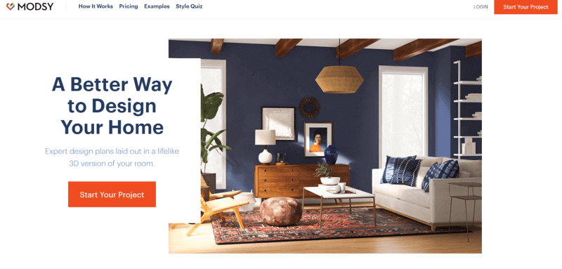
What do you want your visitors to do after they read what your product is about? Sign up / Get updates / Get a Quote — your CTA should be engaging and evoke interest. For example, Modsy, a startup focused on home redesign, offers to “Start Your Project” at first view:
How can you make your CTA powerful?
Make it:
- Strong — use strong verbs
- Shortcut all the fluff
- Noticeable — find the right placement
- Prompt — urge your visitors to act now
To come up with the most enticing CTA, you’ll have to go through some testing. Try different places, play with button colors and copies to get the highest conversions.
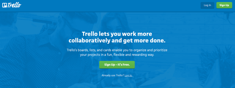
And don’t underestimate the power of the word “free” — everybody loves free stuff, demos, and trials. See how Trello did it:
No bullshit copy
You’ve built or are building an amazing product that solves a certain problem, and your landing page is exactly the place to let the world know about it.
Readers will give you around 8 seconds to grab their attention, so arm your landing page with a bunch of powerful triggers to get them interested. Clearly articulate your value proposition in the header and explain the benefits of your solution in concise language. Remember, that the words you pick affect on how you emphasize with your potential customers (or not).
You’ve probably seen or even have an Evernote app on your phone. Here’s what they say at their front page, in black and white:
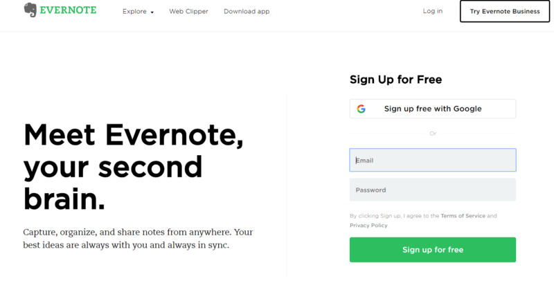
What’s good about this copy — the metaphor “your second brain” gives you a picture of something extremely helpful and productive, some extra capacity that will not let you down. The word “always” is intentionally intruding in that precious space twice as if they knew how many times you missed your notes left on other devices.
Creating a cool copy may not be such a puzzling process if you stick to these rules:
- Focus on benefits rather than features
- Remember that facts tell, but stories sell
- Keep your message simple and consistent
- Get more personal with using “you” and “your”
- Use bullets — meaning structure — meaning clarity
- Use creative ways to make the content sticky (like hyperboles)
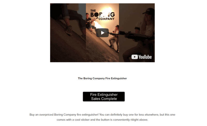
I’ve also got a bold example in my sleeve with some funky content — if you can spice up your copy with some audacity, go ahead for it (but don’t forget that this is an example of Mask’s The Boring Company project , because, you know, he can):
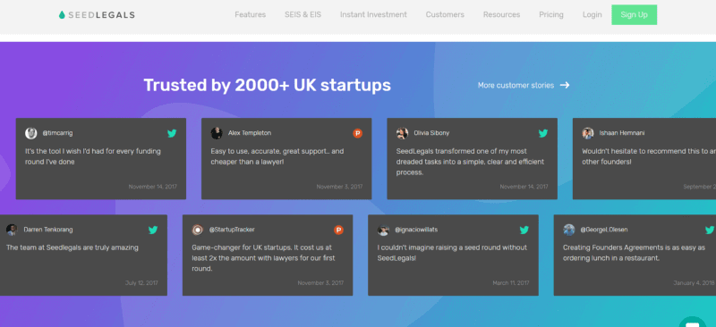
Pull out some compelling client quotes (if you have any). The good part is that they don’t have to be long feedbacks. Here’s how Seedlegals used their customer’s tweet-style feedback:
All the copy should look like a flow that will consistently tell the visitors why they are here.
Why design matters
The human brain processes image 60,000 times faster than text. Make sure the visuals on your landing page give your product a chance to shine.
Most of landing page constructors suggest a variety of designed templates, so pay special attention to the choice of the images for your landing page.
Scooped hands holding some dirt and a small green plant, the man in a suit near the futuristic dashboard — let’s be sincere, chances that everybody had stumbled upon these stocks a dozen of times are very high. Think twice before choosing such images as their artificial crust is killing trust right from the start.
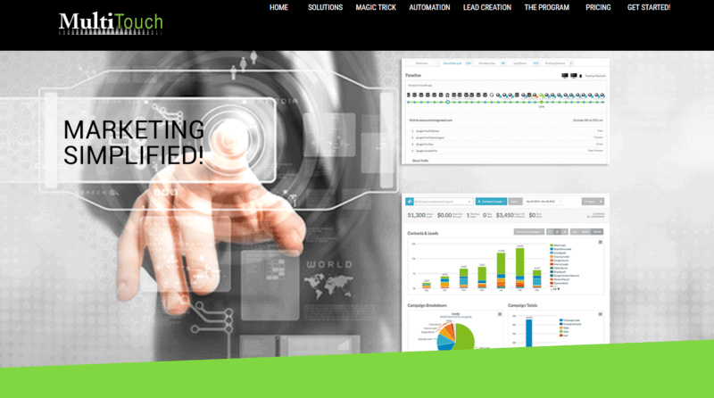
Look at the snapshot above — despite the meant-to-be-persuasive dashboards on the right, that finger on the left totally steals the attention, and then doesn’t direct it anywhere — no CTA button at all. Please, don’t throw riddles on your visitors — the images should be in line with the copy to create a clear picture.
The shots you pick should reflect the tastes of your target market and evoke positive emotions. Browse some free yet cool images on StockSnap.io, Unsplash, and Pexels or purchase at Shutterstock and Getty Images, but beware of those obvious smiling people in suits.
Show every dimension of your product if you can and allow visitors to zoom and rotate photos 360 degrees, so they can study every inch of it.
A video might be a great way to demonstrate how your product works:
If there’s nothing you can brag about yet, shoot an introductory video, where you tell about your mission and introduce the founders like Neopenda startup did.
How to measure it all
When it comes to metrics, there is no one-size-fits-all approach to receive leads and track their performance. What worked well for one company might not work for your business — you have to constantly experiment and tweak your approaches.
First and foremost, install Google Analytics. With this tool, you’ll be able to measure:
- Conversions — the percentage of visitors that sign up (or perform any other action)
- Cost-per-click (CPC) — the amount of money you spent to get a new lead
- Bounce Rate — the percentage of visitors that leave your page before engaging with the content or doing anything
To plunge into advanced study of the customer journey, use tools like Crazy Egg and Hotjar. With heat maps and session recording, you’ll be able to track clicks, depth of page scrolling and get a broader understanding of user behavior.
Landing page builders
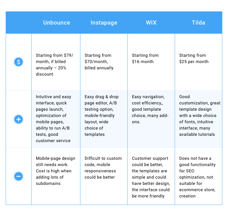
Thank God you don’t have to open a notepad on your screen and start with <html> <body> … to create a webpage — with a variety of online constructors this might be a no-brainer. When choosing one for your landing page, pay attention to how friendly is the interface, how wide is the template choice, how secure is the platform and how good is customer support.
Let’s not dig into the technical specs — take a look at some of the most popular landing-page builders with their pros and cons (based on user reviews from trustradius.com)
Less guessing, more A/B Testing
A/B testing is about trying different approaches and measuring their effectiveness. More efficient elements mean more powerful landing, which in its turn means more visitors and conversions. If you think A/B testing is a waste of time, here’s an example to alter your mind:
In a single A/B testing, MOZ, an SEO software company, was able to increase sales by up to 52%.
What can you A/B test?
- The header
- The value proposition copy
- CTA button
- Images vs Video
- Form fields
THE LANDING PAGE TO VALIDATE YOUR MVP IS READY: WHAT’S NEXT?
“Ta-dam!” you’ll hear in your head once the landing page is ready, and then “Woohoo!” when you ensure that everything works as you designed, and last one “yaay” when you show it to somebody and people will like it.
startup landing page
But that’s not all: somehow you have to bring real potential customers, who will actually validate your MVP and will order your product. Here are some powerful ways to do it:
1. Power of social media
Pick up a couple of relevant platforms that will work for you, and post compelling content about your product.
- Instagram, Pinterest — if you can share some classy photos/infographics
- Facebook, Twitter — good for B2C and B2B
- LinkedIn — can help reach potential customers through “inmails”, groups
- Quora, Reddit — will bring you leads if you roll up your sleeves and will spend some time on creating quality content
2. Power of guest posting
Get mentions from influencers that are popular among your target audience. To discover the top bloggers, use a tool like buzzsumo.com and search for the relevant keywords.
3. Power of startup platforms
Feature your product on the websites as SpringWise, KillerStartup, Gust.com or Producthunt. This way, you’ll get exposure + backlinks that will help Google rank your page higher.
4. Power of SEO and advertising

Create a Google Adwords account, find the relevant keywords with a Google Keyword Planner, choose target locations and run a Google PPC campaign.
Social networks are also a powerful tool to reach your audience — set up campaigns and promote different types of content through Facebook, Twitter, LinkedIn.
IS THE LANDING PAGE GAME WORTH THE CANDLES?
Have you ever heard this joke? “A startup founder walks into a bar, sees only one stool and one bottle because the owner built a minimum viable product.” You know what? It’s better to open the doors and show your product to people who will tell you that your beer sucks and the chair is super-comfy, rather than build a strange drinking place, a useless Smart Toothbrush, a five-star bird feeder or whatever the heck it might be.
This article about landing page is written by Yaroslav Lehenchuk — Head of Product at Product Tribe.