— a hands-on (minus the BS or sales) guide
When we tried to create an impressive facebook header video for our page, we couldn’t find any good tutorials or guides upon it. This article is the sum-up of our learnings and might be helpful for anyone trying to build a cool video, too.
There are a lot of “How to create a cover-video using…” and “Customize Facebook cover templates online” articles and tutorials around. To create a video as the header of our page, we searched for practical advice. But there was nothing about the impact of such videos or the psychology behind it. So we decided to make some of our own.
This is a practical guide to facebook video covers — including storyline, basic assumptions, and measurements of the video itself.
And the best thing: We do not have any direct economic stake in this article. So there are no annoying sales, advertisement or marketing mingled in between or at the end. All we hope for is helping others and raising awareness for our mission at Trudia.org — enabling trustworthy news and content.
So… Why do you need a video?
That’s right Kevin, we are impressed by cover pictures as well…
The video should do two things: gain interest in your brand and deliver its key message.
A simple photo topping your profile isn’t that catchy. So, we @trudia wanted to get the full potential out of our Facebook page.
Whenever you open a new facebook page, the video is the first thing you look at.
It’s in your DNA to pay attention to moving things.
Movements demand your immediate attention. They might be a thread or a possible thing to eat.
Welcome to the 21st century, caveman!
Ideally, the video is so interesting people stay on the page. At the same time, it should deliver the key message of our brand. So if you are a small café with a Facebook page and you create a video-banner showing someone making cappuccino, it is pretty clear what you are doing. But is this gaining interest in your café? Not necessarily. So, you may choose something more unique.
Note: For brands, a cover video is an easy way to highlight initiatives and launches — becoming part of your social media marketing lineup.
How do you start the process?
Before starting to create a video, think about what your brand stands for. Get a couple of colleagues or team members together and do a quick brainstorm session.
Before creating the video, we thought about the core elements of our brand: Solving Fake news and enabling trustworthy content.
 Find out more about Trudias mission here
Trudia stands for media you can trust. To gain interest in the discussion about misinformation, disinformation and fake news, we wanted to create a video about events and persons associated with the topic.
To symbolize that those problems (after Trudia 😉 ) belong to the past we decided to make a black and white video.
To make the video more interesting, we choose a slideshow with quickly changing pictures. Different impressions are flinging straight at you. And as a top layer, the unanswered question “Trust Media?” remains.
But we noticed pretty soon that just playing pictures were not going to do the job:
- If pictures change too quickly, you don’t have the time to look at them closely.
- Complex pictures with a lot of detail look like chaos. You are not going to deliver any message using them.
- Faces are great! You can recognize their emotions and they may evoke emotions itself, especially if you know the person or the picture.

- What’s important here is to change the length of visibility from photo to photo. Seeing every photo half of a second gets boring after a couple of shots.
- If you want to highlight something, just show the photo a bit longer than the one before and after.
- To make your video or slideshow even more interesting, you can apply a zoom in or zoom out effect every couple photo.
Important technical details:
Facebook sets special requirements for cover videos:
- To upload a video, it must be at least 20 seconds long but no longer than 90 seconds.
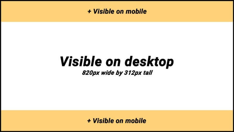
- The recommended resolution is 820 x 312 pixels.
- Since no one really creates videos like this, we would recommend to simply go for 1080p.
- Unlike on mobile devices, the video will be cut off at the top and bottom when accessed by desktop. Since it is mobile first, with over 90 percent of daily users accessing the platform with mobile devices, this shouldn’t be too big of a problem. For more details about the resolution check out Buffers article.
 What you see on facebook — partitioning of a 16:9 image
- If you want to show text on your video, make sure to choose a color that stands out and your text can be read easily.
- Or do something contrary: write something barely visible. If it fits your message and looks good then its fine. We choose a goldish color — its the complement of the blue in Trudia´s logo. It definitively stands out more than a dark blue on a black and white background.
Let us know what you think about this article and if it was helpfull 🙂
What would you do differently? Are you thinking about creating a similar video for your Facebook page? Whats important detail did we miss in this guide?