Conversion Rate Optimization For Dummies in 2019
🤡 Think about the last time you went to McDonald’s.
There’s a process you have to go through to get your Big Mac.
You have to…
- Pass by a McDonald’s and feel like making that U-turn to get to it ✔️
- Wait in line ✔️
- Check out the menu ✔️
- Order your food ✔️
- Pay at the 1st window ✔️
- Pick up your food at the window 🍔
Congratulations!
You’ve just been through a sales funnel:
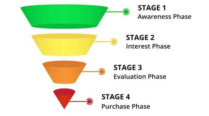
The definition of sales funnel is:
“The buying process that companies lead customers through when purchasing products. A sales funnel is divided into several steps, which differ depending on the particular sales model.” — RingDNA
Let’s take a look at how you got that Big Mac again…
- Pass by a McDonald’s {AWARENESS PHASE}
- Feel like making that U-turn to get to it ✔️ {INTEREST PHASE}
- Wait in line ✔️ {EVALUATION PHASE}
- Check out the menu ✔️
- Order your food ✔️{DECISION PHASE}
- Pay at the 1st window ✔️ {PURCHASE PHASE}
- Pick up your food at the window 🍔
So what does that have to do with conversion rate optimization?
Everything You Need To Know About Conversion Rate Optimization
Imagine you’re a company who wants to increase your revenue…
How would you do that?
Maybe you could try…
- Content marketing (blog, YouTube, podcast, etc)…
- SEO…
- Social media marketing…
- Facebook advertising…
- Google AdWords…
All of these are really great options, but there’s 2 problems:
#1 — They all need time, money, and resources
#2 — They’re all focused on the Top of Funnel
Too many businesses and marketers focus on top of funnel tactics.
You need to know this…
Yes, marketing IS a numbers game… But it doesn’t matter how much you fill the top if you drop the ball through the rest of your buying process!
So What is Conversion Rate Optimization?
“Conversion rate optimization is…
– Finding out why visitors aren’t converting
– Fixing it
– That’s it.
It sounds obvious, but a lot of people forget it — and they leave a ton of money on the table as a result.”
🚀 4 Strategies For Conversion Rate Optimization
Don’t worry, conversion rate optimization is simple!
It’s not split testing button colors or trying to improve vanity metrics.
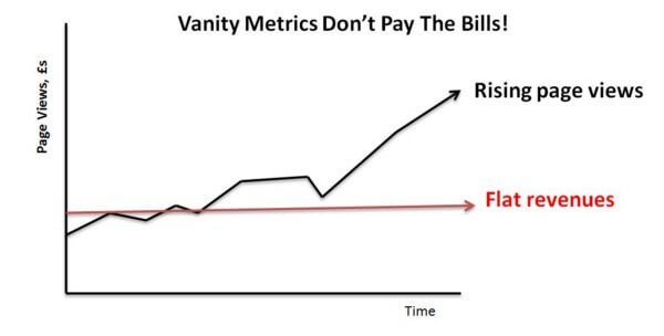 A quick introduction to vanity metrics if you weren’t sure what that is 😊
Conversion rate optimization (CRO) means understanding every step of your existing buying process, uncovering where prospects leave, and fix that step.
Here’s a simple framework to help you do that:
#1 — Get Clear On Your Goals, Eliminate Unnecessary Choices 🚀
An important part of high converting landing pages is clarity in your goals.
Your page shouldn’t try to get people to do more than 3 different functions… The page quickly becomes overwhelming.
You’ll want to focus in on having 3 or FEWER ideal conversions per page because people can’t focus on much more than that.
Although, 1 ideal conversion is best.
Just look at sales pages…
For example, marketers recommend removing links from your sales pages:
- Top navigation
- Sidebar navigation
- Footers
- Social media
Anything that distracts viewers from your ideal conversion…
Because you only get 1 click 🖱️
The honest truth is you’ll only get 1 click at best on your pages.
If you “spend” that click on checking out your Facebook page instead of buying the product, then you’ve probably lost that sale…
You want to eliminate unnecessary choices.
If you want people to download an ebook.
Or start a free trial.
Or schedule a sales call.
Make sure that every element of your page works towards that goal.
The only exception is your home page (where you’d want users to explore your site, unless you have an optimized 1 page layout site), and possibly blog posts(when you’re not optimizing to distribute post-specific content optins or to collect emails).
How do you know what kinds of link outs are stealing attention from your ideal conversions?
Here are 2 live examples I hope help you out:
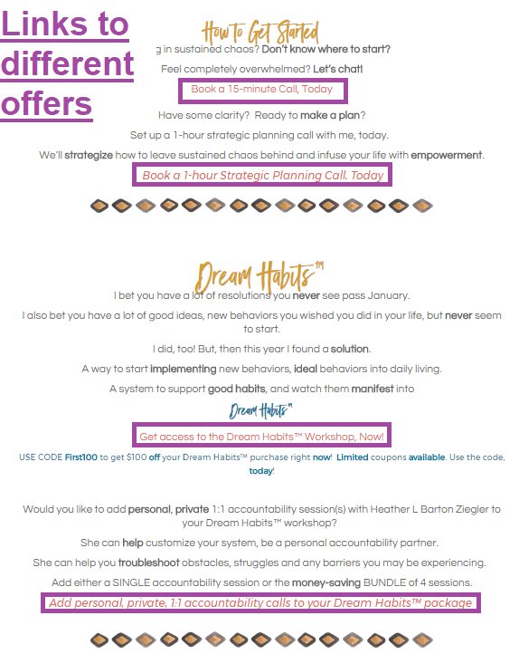
Example 1: Reducing offers on-page
Before 3 different offers were being promoted on this landing page.
Because the copy was trying to communicate so much, prospects got a case of paradox of choice:
 https://www.heatherbzliving.com
Since an offer for one of the products (1:1 accountability sessions) was already being made on the backend of the course, we were able to eliminate all of the offers besides the course:
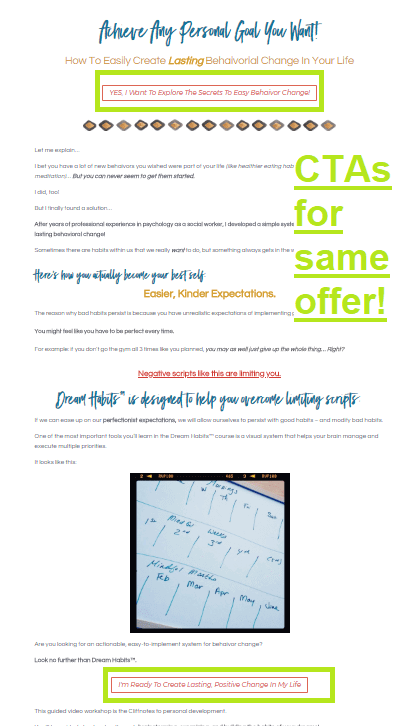 https://www.heatherbzliving.com
You can learn more about the page’s optimization process here:
Example 2: Reducing outbound click opportunities

In this case the site owner’s goal is to get better, cleaner data on how much traffic she’s sending to her vendors.
The challenge is tracking all of the traffic that’s being referred out.
Sometimes users visit 3rd party websites (like Pinterest, Facebook, etc) before contacting the vendor. That means the source of traffic would appear as “Facebook” or “Pinterest” if the prospect clicks through to the vendor site from a 3rd party website, even if the prospect actually discovered the vendor from Marry Me Tampa Bay…
Instead, we can eliminate the number of options by taking away the opportunity to click to social media.
We can further optimize the conversions to contact the vendors in a way that’s streamlined and results in clean data by
- Changing the text links to buttons
- Bringing the calls to action above the fold
In comparison, look at the vendor page of this large competitor:
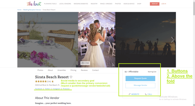
My above recommendations seem to be on the money.
#2 — Understand What’s Happening On The Page 🚀
After you get clear on the 1–3 conversions you’re looking for on this page, you have to understand what’s going on.
What’s currently taking away attention from your ideal conversions?
How do you figure out what’s going on with your page?
Here are some tools to help you:

Google Analytics
There’s 2 things we’re going to look at today with Google Analytics:
- On page time
- The 1st page traffic sources send prospects to
#1 — On Page Time
A good rule of thumb for “on page time” (it’s more complicated than that) is between 1–3 minutes per page. (If the average on page time is below 1 minute it can definitely use improvement.)
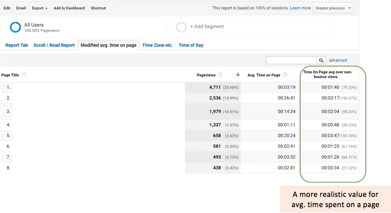 Read about what this metric is here.
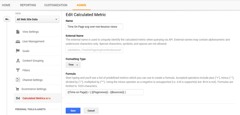
Through a much more complicated conversation, Google Analytics’ “Avg. Time on Page” metric is sometimes inflated sooo… The above custom metric uses this formula instead:
 Read why here.
You can tell a lot about what’s going on behaviorally from page and session durations.
For example:
- People close out of the page in 10–15 seconds because they can’t find the information they’re looking for quickly enough
- People bounce from your page because you’re revealing the price before they’re sold
#2 — The 1st page traffic sources send prospects to
Let’s say your biggest traffic referrer is Google…
Or social channels…
Or direct emails…
Whatever your top referral channels are, you can use these directions to create reports that show you which pages people visit from specific sources.
You can compare relative volumes of traffic from different sources within the same dimension: for example, the traffic from different search engines, campaigns, or mediums. Overall comparisons let you make some initial determinations about which channels are most effective or offer the best return.
This will tell you important things about the audience’s psychographics like:
- Are they warm or cold traffic?
- Where are they in their search process? (Eg If most search engine traffic is going to your website’s inner pages, viewers may be in an awareness phase of the buying process. If most of the traffic to that page comes from direct links via email, these viewers are probably closer to the decision phase.)
- Are they in the top or middle of the funnel?
- What’s their level of problem awareness? (Based off of what pages they look at next in the above flow. Someone who reads 1 page and goes straight to an offer is much closer to making a purchasing decision than people who go on to read 1–3+ informational pages after reading an initial informational page.)
Then you can focus on optimizing elements like the messaging specifically towards that type of traffic.
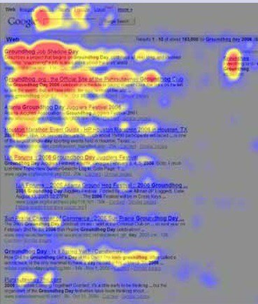
Heat Maps
Another layer of dimension to this analytic data is heat maps.
For example…
Let’s say you have a page with a video sales letter, and a low on page time. (15 seconds)
If you see the fast forward button on the video is being clicked a lot, and people are scrolling down to the price — they might be finding the price too early and bolting.
How To Make Decisions With This Information
There’s a lot of moving parts to a buying process, but these tools should help you narrow down what the specific sticking points of the step you’re optimizing.
Now that you’ve found the problem areas, you can change the design and messaging to get better results!
#3 — Simplify Design 🚀
 Example of layer cake scanning pattern
Part of the reason why people might miss important information on your website is when the design is too busy.
Understanding how people read on the web can help you make conversion rate optimization decisions.
From the Nielsen Norman Group:
Layer-cake pattern occurs when the eyes scan headings and subheadings and skip the normal text below. A gaze plot or heat map of this behavior will show horizontal lines, reminiscent of a cake with alternating layers of cake and frosting.
Spotted pattern consists of skipping big chunks of text and scanning as if looking for something specific, such as a link, digits, a particular word or a set of words with a distinctive shape (such as an address or signature).
Marking pattern involves keeping the eyes focused in one place as the mouse scrolls or finger swipes the page, like a dancer fixates on an object to keep balance as she twirls. Marking happens more on mobile than on desktop.
Bypassing pattern occurs when people deliberately skip the first words of the line when multiple lines of text in a list start all with the same word(s).
Commitment pattern consists of fixating on almost everything on the page. If people are highly motivated and interested in content, they will read all the text in a paragraph or even an entire page. (Don’t count on this to happen frequently, though. Assume that most users will be scanning.)
Here are some design guidelines to use as a starting point:
Legibility Over Style
Sometimes things look cool, but they’re not so easy to read.
For example, using white transparent text backgrounds over images…
This might look nice and communicate your personal style, but it’s difficult to read.
If the image is important and plays a function, it should be featured outright. Otherwise it’s best to omit it. (Full on opaque white over images is OK.)
Choice of Colors
The 2 big problems I see with colors are:
- Clashing palettes
- Business
#1 — Clashing palettes
Probably the best place to start looking for color inspiration is the Material UI color palette list.
Material UI is the official Google style guidelines.
Being the leader of search and heavy into cell phone tech, you can be confident these colors will look great online.
Want a more in depth guide on how to pick colors that go together, and deciding what text elements should stand out?
Google has AN AMAZING free online design guide here.
^^^ Highly recommend that. You don’t need any other resources.
How many colors should you pick?
You want to stick to 6 or fewer colors. (Plus Black and White.)
Here’s an example:
Tools To Help You Identify Problem in Design Elements:

Free
Use Loom and ask friends to test out your buying process.
Paid
You can find advanced information about eye paths online here:
4 Ways You’re Annoying Your Customers
Have you ever heard a really annoying noise before?blog.markgrowth.com
#4 — Streamline Messaging 🚀
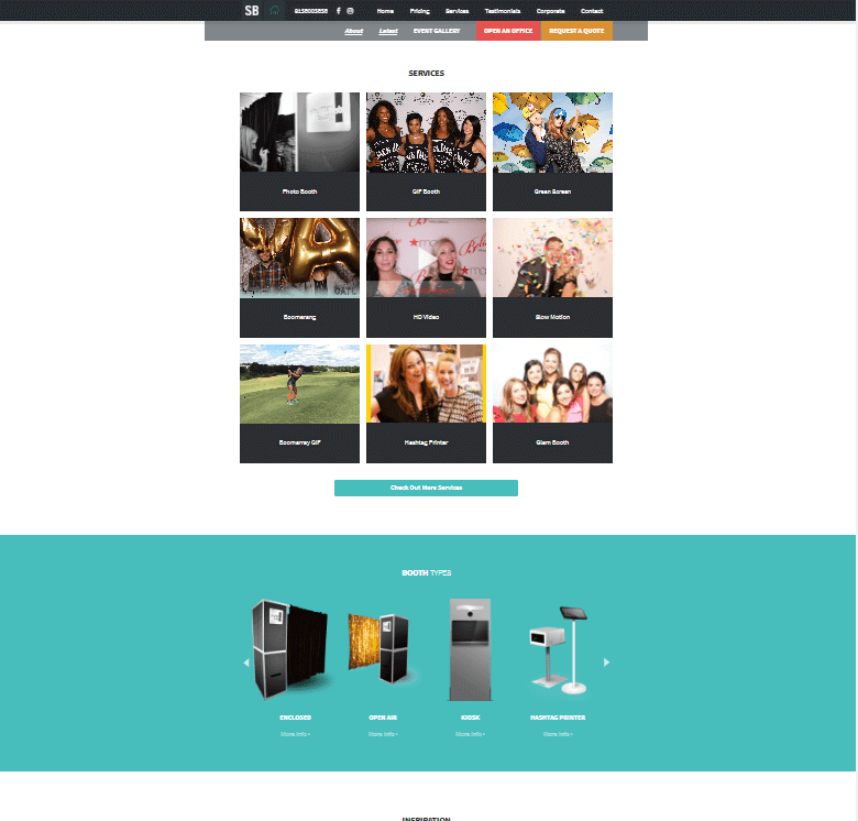
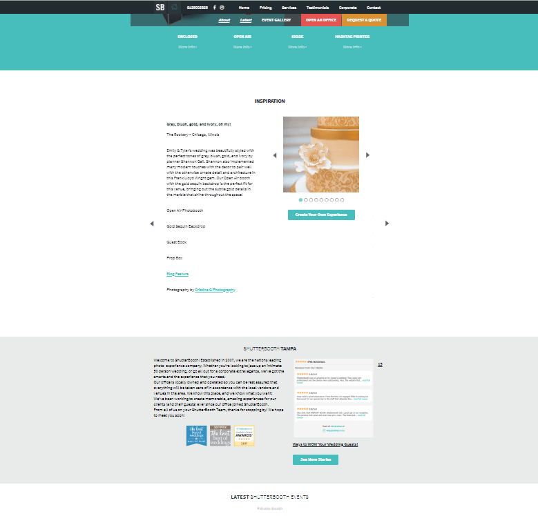
Business owners who are inexperienced at framing messaging tend to create pages and marketing assets that are organized haphazardly. The sections don’t usually have clear functions.
Take a look at this layout:
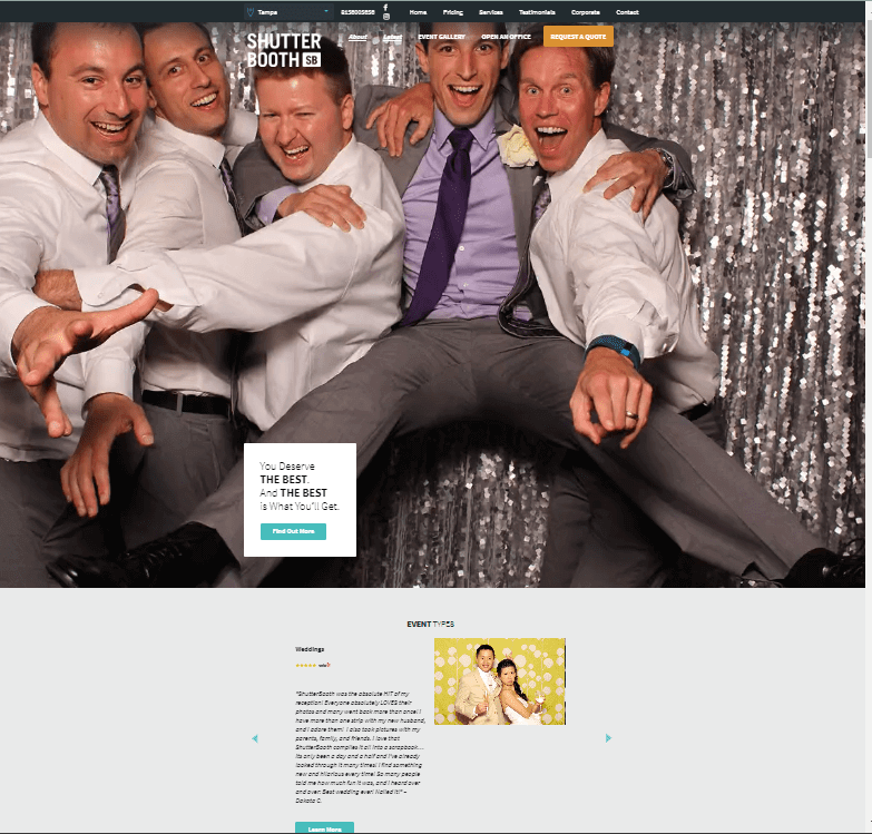 https://shutterbooth.com/tampa/
 https://shutterbooth.com/tampa/
 https://shutterbooth.com/tampa/
Going back to the earlier conversation on creating a clear hierarchy for your goals, this page is just trying to tell you way too much!
They’re asking you to…
- Explore the website
- Build trust through testimonials
- Select the specific service you want
- Introduce various booth types
- Show inspiration
- The testimonial block isn’t unified
- The booth types are probably irrelevant because I’m sure to a certain degree the type of booth depends on the service you want
What is the primary goal of this?
Secondary?
Tertiary?
There are way more than 3 messages trying to be communicated…
Be sure that every element on the page directly supports your focus conversion(s) — or remove it.
Create A Clear Messaging Hierarchy
What do I mean by a “message”?
There’s a difference between a “page section” and a “message”.
There are pages with different page sections that only have 1 primary message.
Contrast that with this iPhone sales page:
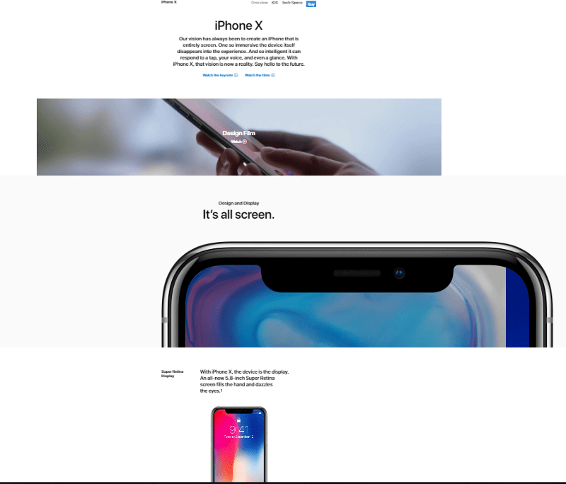 https://www.apple.com/iphone-x/
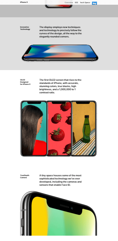 https://www.apple.com/iphone-x/
There’s obviously a difference between this landing page for the iPhone and the earlier home page.
There’s no fat on this page 🍎
Yes the page may have multiple sections, but it’s all 1 message.
(You’ll notice the menu bar even gets minimized as you scroll down 😉)
Closing Thoughts
We covered A LOT of ground together, so you should bookmark this articleto come back and reference it.
Conversion rate optimization might still feel overwhelming to you even with a great guide like this.
That’s okay 😊
The truth is that at this point, you know everything you need to start creating a conversion rate optimization plan.
Now the only way you’ll get more clarity is to start!
Want to learn more? Next steps:
Reverse Flat Revenue With Conversion Rate Optimization
How to A/B Test + Optimization Lessons from 2 Homepagesblog.markgrowth.com
The Ultimate Guide to Google Analytics for Busy Entrepreneurs
Save 100’s of Hours & $1000’s on Google Analytics Training in 2018blog.markgrowth.com
4 Ways You’re Annoying Your Customers
Have you ever heard a really annoying noise before?blog.markgrowth.com
Thanks for reading! Did this guide help you? Please spread the word by hitting the 👏 button and share on Facebook, or Twitter if you find the article valuable 😊
^ Psstttt… Did you know this box gives loot? Enter your email for free actionable marketing guide
^ Add your email to this form if you want actionable business and marketing content emailed to you weekly 😊
Jamie Doershuck is a marketing consultant at The Doer Co who helps 6 and 7 figure businesses optimize their conversion rates. You can work with her here.