As competition in the digital world continues to intensify, more and more businesses make use of advanced tactics to build their audience database and leverage on it to boost their sales.
However, due to a handful of inevitable reasons, did you know that your email contact list degrades at a rate of 22.5% per year?
This huge chunk often comes from leads who (1) change their jobs and email addresses, (2) unsubscribe from your email list, and (3) are automatically opt-out of your database because of non-responsiveness.
This simply means that you’re losing more and more contacts every single year.
Why is it alarming
Email marketing is one of the most successful and profitable forms of marketing today. In fact, 44 percent of people in the United States and Canada check their personal email one to three times a day.
If you fail to maintain a solid email database, you’re decreasing your authority level and fewer people would be exposed to your brand. This may evoke a negative impact on your business in the long run.
What to do about it
There’s one effective strategy that we use to generate fresh leads and make up for these losses without breaking our budget – popups!
Popups are windows that appear in the foreground of the screen, generally designed to attract visitors’ attention while browsing.
There are a lot of things you can do with popups and now we’ll feature 5 most advanced tactics that you can do to grow your email list immediately!
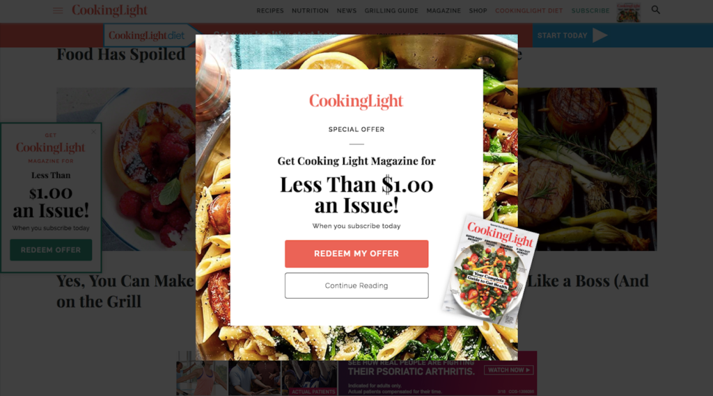
1. Lay down irresistible offers and high-value lead magnets for first-time visitors

Source: webdesignerdepot.com
This is simply how this works: you give your visitor something for free in exchange for an email address or any other contact information.
A new customer relationship building strategy, this lead magnet successfully ushers visitors into your email database. It may be in the form of a discount, an exclusive offer like free shipping, or a downloadable e-book.
Importance of lead magnets
Since contact details are too personal, people are savvier nowadays, perhaps because of the increasing number of data breaches. Surely, they won’t just give theirs no matter how credible your brand is. That’s why marketers use lead magnets to give them a captivating reason to do so.
Case in point: You visit one website and a popup shows, asking for your email so you can stay up to date with their latest offerings. You jump to another website and a popup shows, asking for the same thing, but now offering a special 50% OFF coupon code for your first purchase. Which one do you think you’re more likely to give your email right away?
The lure of lead magnets to attract hot leads is really powerful so don’t waste the opportunity to boost your email list through popups!
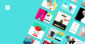
2. Tickle their curiosity with an eye-catching popup aesthetic

Source: elementor.com
First things first! Just like any other component on your website, what you put on your popups contributes to how your visitors perceive your brand.
When creating popups, you only have two goals: to please their eyes and to persuade them to take action.
Although it’s highly subjective, it’s important to match your popups with your website design. You can’t be too playful on colors and fonts if your website talks about professionalism at work, mental health, or other serious stuff.
You must also observe the proper placing of words. Your call-to-action deserves the utmost emphasis so your visitors would know exactly what it’s for even at a short glance, especially if it’s something irresistible and eye-catching, like free giveaways.
If you’re not that confident in your design skills but you really want to create high converting popups designs, you can always rely on free online popup builders. Such tools would enable you to utilize popups to grow your email list even without prior coding skills.
3. Be sure to display your best-fit popup at the right time

Source: Behance.net
A lot of times you may hear people say that popups are annoying. It might be true, but here’s a simple tip on how you can make the most out of it without being a disturbance.
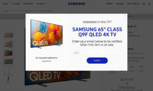
Timing is crucial when you want a high conversion rate. Your popup must give visitors enough time to browse. Allow them to reach a certain part of the page, especially when you think they’ve understood what your website is all about.
Make your popup appear when it’s the least disturbing and not when a visitor is entering.
If you’re not sure about the most effective timing that would work for your business, you can check the average time spent on your site through analytics and set your popup’s timing depending on the result. Remember that if your popup appears too late, you might miss a large number of potential subscribers.
Exit-intent technology can also help you facilitate this through the use of advanced triggers. For instance, if your visitor is about to exit the page without buying or leaving anything, that’s the perfect time to show enticing exit popups, enabling you to recover carts, upsell items, and grow your email database.
4. Never overwhelm your visitors with lots of fields to fill in
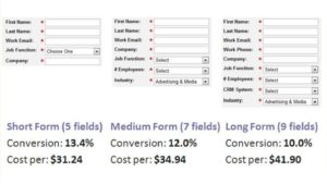
The fewer fields your popup has, the higher its conversion rate. This is one of the golden rules to consider in your design principles.

Source: ventureharbour.com
In a case study conducted by MarketingExperiments for Marketo, a long form with 9 fields received a 10% conversion rate. When they reduced the fields to 5, they got 13.4%, which was undeniably a good increase in conversion.
Although this is not always the case, however, shorter forms require less work from users, so it makes sense that a lot of case studies such as the one above proves the statement to be true.
5. Make AB testing a regular routine.

Source: MailerLite
Now, how would you know if your popups are really working?
There’s no other way to know but to test them, so you can figure out what exactly the element that works best for your target audience.
A/B testing is a research methodology where two or more variants of a page, email, or any marketing assets are randomly displayed to users. After a certain period of time, a statistical analysis will then be shown to determine which version of the variant performed better, depending on the conversion goal.
Here are some of the things you can A/B test to maximize the fullest potential of your popup strategies:
- Long copy vs short copy. If your visitors are busy, more likely they won’t bother to read long copies of your popups. Since this is case to case, always ensure that you’ve got the right mix of words for your come-and-go visitors.
- Bold vs meek headline. Although this actually depends on your content, bolder headlines are more striking and easy to read.
- Upfront vs mysterious offer. The first one is more popular. It’s telling the visitors right away what they can get, like a 20% discount. The other one has suspense in it and the ability to tickle one’s curiosity, just like asking them to sign up before they can claim their surprise gift.
Other elements you can test are timing, number of fields, placement, and many others.
It’s important to make A/B testing a routine because not all that works for others will work for you too. This might take time, but sooner or later you’d get the full picture of the psychology of your customers, allowing you to strategize better on how you could easily get their contact details for your database.
Wrapping Up!
To boost your conversion rate and grow your email list through popups, never underestimate how a simple free giveaway or an exclusive offer could land you to your goal. These lead magnets are key to attract customers, especially if you put them in eye-catching popup designs that are well-aligned to your brand.
Timing is also crucial to increase conversions. Keep in mind that you’re asking them a favor, and that’s to get their email address, so be sensitive not to be a disturbance in any way. As much as possible, make it easy and convenient for them by keeping the fields fewer.
And if you want to know how you can improve your strategies, customize your popups based on the results from A/B testing. This would enable you to expand your popups to their fullest potential and enjoy return of investment immediately after.
Growing your email list may take time, but it’s definitely worth it!
What’s next?
Once you see that your popups are doing a great job and that you’re already reaching your targets, the best next thing you can do is nurture your relationship with them. Engage with ease using GetGist’s advanced email marketing features.
We’re excited for you to reap the rewards of having a strong email database.
Start implementing these tactics now and enjoy getting more and more leads every day!
Author: Gal Dubinski, co-founder at Premio. They make WordPress plugins and Shopify apps that help
website owners get more out of their websites.