When I first decided to join ConvertFox, Jitta (the Founder whose birth name is Raghavender, but goes by Jitta), one of the first things I pushed for was to rebrand the company.
I knew that we were going to be starting our marketing from scratch, and doing the rebrand six months or a year from now would be a pain. It would interrupt the flow of everything we have going on from both a marketing and product standpoint.
He agreed, and we decided to bite this bullet early on. So this was actually the first objective he gave me when I came on.

I am not a branding expert, but naming things usually came to me pretty easily. So, I figured I’d have this finished in a day or two.
I was wrong.
Before I get too far into the new name, it’s important to understand how we became ConvertFox to begin with…
The ConvertFox Name
I appreciated that Jitta was open to the rebrand to begin with. Sometimes, it’s your baby and egos can get in the way.
I mean, it’s not a horrible name. There’s a brandable icon at least with the fox. The “convert” concept came from the fact that we helped you take website visitors and subscribers and turn into customers through communication.
When you’re first starting out – you have no idea if what you’re doing even matters. Will people even pay you for what you offer?
So, people typically go one of two ways with their name initially:
- They spend WAYYYY too much time trying to come up with the perfect name for a business that most likely will not even succeed in the first place
- They hardly spend any time or thought on the name, because building the product and getting customers is the first priority.
In this case, we clearly fell into bucket number 2, which isn’t a bad thing.
We are much more than a “conversion” tool.
We needed a name that reflected that.
Brainstorming Ideas
So, I started coming up with a list of “seed” keywords.
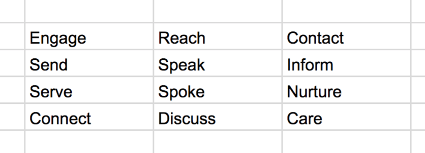
My goal with the seed keywords was to represent what we did. This would give me a base to play with.
I then needed something that reflected more about our vision and what we ultimately wanted to become.
We’re an all-in-one platform of products that help our customers communicate with their contacts.
We want to help our customers deliver awesome communication experiences across sales, marketing, and support teams while aiming to be a single source of truth for their contacts.
So we needed some words that meshed with this vision.
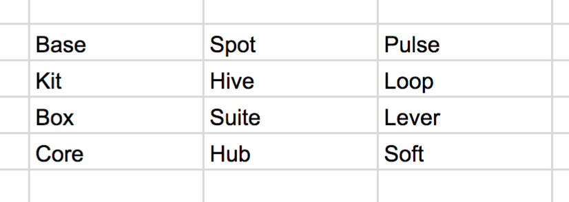
It was during this exercise I realized just how great of a name HubSpot was. It’s the center of everything.
They didn’t start out that way obviously, as they focused on just content marketing mainly. But their name was something that allowed them to expand without needing to go through a rebrand.
In any case, going through the seed keywords and these secondary keywords and putting together ended up being fairly fruitless. Either domains weren’t available, or they just didn’t work.
I did like ConnectKit, but there’s already an email marketing tool called ConvertKit and I just felt this rebrand from ConvertFox to ConnectKit was way too similar. Besides, GoDaddy.com told me…
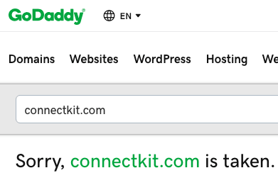
This would be a recurring theme every time I thought I had the name.
So it was back to the drawing board.
I expanded the seed keywords using my handy Thesaurus.com as a reference.
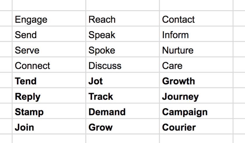
I took these new (bolded) keywords and paired them with the same secondary keywords.
No luck.
So then, I Google’d “one syllable animals”. Then for objects… Eventually, I expanded the secondary keywords.
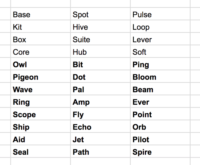
Still… nothing was quite resonating.
Brandable Domains
One of my favorite resources for naming inspiration is BrandBucket.
I decided to take a step back from the joining of two words and see if I could take one of our seed keywords and put a “brandable” finish to it.
So I put a list of these “finishes” together.
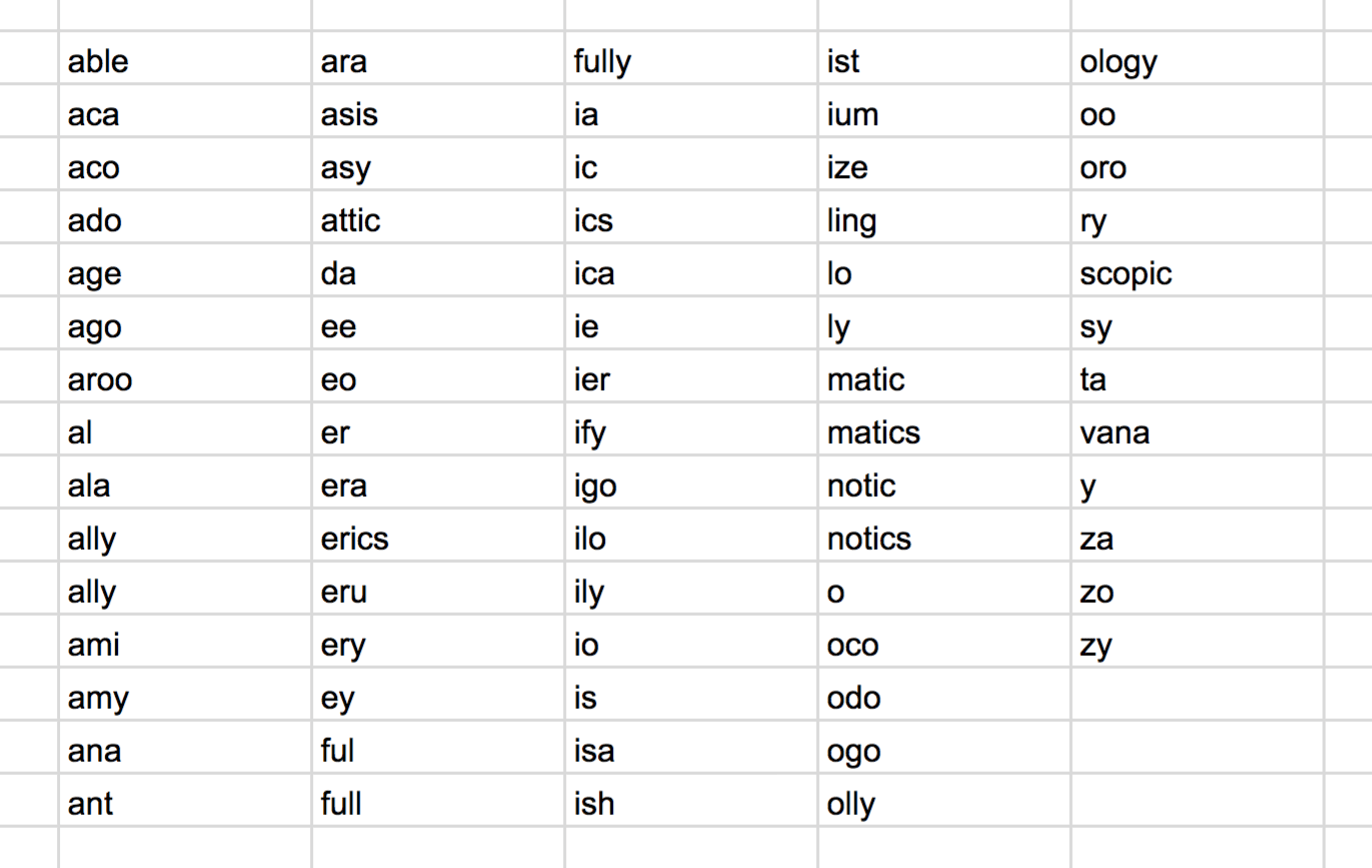
I’m sure there’s tons more as well, but this was what I came up with.
Then I went back through all of the seed keywords, even the secondary keywords, and ran them through GoDaddy.
Days Go By
By now, I’m six days in. I had around 30 or so domains that were starting to feel “good enough”.
Thought I had a few that were slightly better than “good enough”, but nothing was screaming, “THIS IS IT!!!”
Jitta and I both agreed, if we’re going to go through the trouble of rebranding… we needed that “THIS IS IT!!!” feeling.
I was waking up at 3am with ideas.
My phone used thesaurus so much it became the first thing Google recommended to me when I opened a new tab.
I had talked with other entrepreneurs I knew for feedback.
I even involved my friends who have nothing to do with entrepreneurship or the software world.
I was getting desperate.
My FIRST project, and it was not going well.
I’ve already gone much longer than I had anticipated.
I started to feel the stress of failing to deliver that positive first impression. The stress of disappointing the person who had to go through board approvals to bring you on.
Quicker Research
One of those 3am wakeups hit me. The word “post” came to me.
I liked it for the relevant meanings to our business. My initial thought was a post like a command post, but also a post as in a message.
I put it into the thesaurus and saw the meaning for “upright support” as well as “mail service”.
It touched on the “focal point” we wanted to be. It had relevant meaning to our products.
I thought, “my goodness … I think this is it.”
But as I played with the secondary keywords and the branding, it just wasn’t coming together.
I was now getting super frustrated with how much time I was spending on each word as I had hundreds of domain combinations to check.
So, I actually reached out to a website developer I’ve worked with and had him spin me up a quick company name generator and domain checking tool using all of the keywords and brandable finishes I came up with.
I would just put in the word, then it would check for domain availability across all keywords.
This saved me TONS of time.
“THIS IS IT!!!”
As time went on, I was also starting to feel like “post” was going to be missed on most people in our target market.
I didn’t want people to feel we were about social media posting or scheduling, or message board posts, etc.
Back to square zero.
It was almost 11pm and I was laying in bed.
Still trying to come up with the name. I put in “Center” in the Thesaurus as I had done several times before…
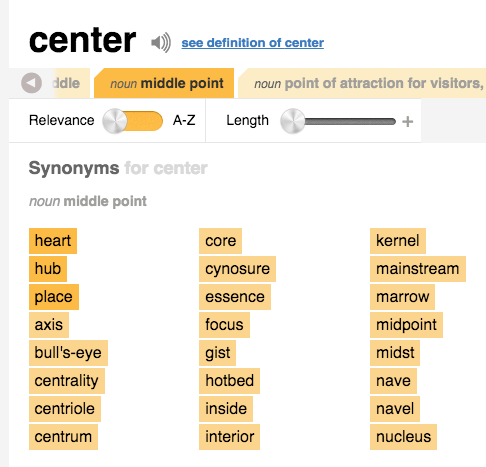
But this time the word “Gist” in the middle of the second column really stuck out to me. I clicked through, then clicked for the specific definition:
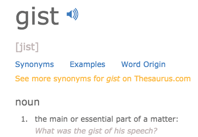
I sat up in bed. I could feel the excitement running through me.
We are trying to be the central source of truth for your contacts.
So the “main or essential part of a matter” really resonated.
The fact it was commonly used in reference to a discussion was also relevant since we’re a communication platform.
I liked the simplicity of the word so much, I felt like we didn’t even need other keywords or brandable finishes to it.
I went to gist.com and obviously that was taken. Although registered, it’s not active.
I went to other company websites using Gist, and nothing was relevant to what we do.
So I reached out to Jitta:

About an hour later, Jitta responded:

So we played with the domain variations like gisthq.com, getgist.com, etc.
We settled on GetGist.com.
It was still listed as a premium domain listing on GoDaddy that we had to purchase. So we decided to sit on it for a couple of days to digest it all.
Ultimately, we felt this was the perfect name for everything we wanted to represent.
Logo Design
Now the fun begins. We needed to actually bring the name to life with a new logo, new colors, etc.
I began performing research on color meanings.
We ultimately decided to settle on Sky Blue as our primary color due to the relevance to both “communication” and “technology”.
We decided to outsource the logo design to 99designs.com.
There were ultimately almost 150 logo submissions, but unfortunately nothing was quite all the way there. So we took the 99designs refund and went back to a design agency that we used originally for the ConvertFox brand.
They started with our brand style guide which was a great exercise.
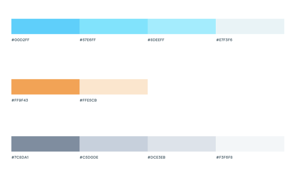
They also came up with a few fonts and we settled on Graphik. This is something we use everywhere.
Logo Meaning
We went through quite a bit of back and forth. Most designers we had worked with up to this point used the “G” in the name and tried to make that the logo.
However, we decided to step away from that thought process and come up with an icon that reflects the brand, our mission, and where we plan to go in the future.

We liked this concept for a few reasons:
- There are three “loops” to reflect the three pillars of what we offer; marketing, sales, and support software
- Everything is interconnected to reflect the entire customer journey and different paths people go down
- The center loop is actually similar to a map / location icon to reflect being the single source of truth for your contacts
What’s Next
So where do we go from here?
Gist is going to continue to evolve the product. We’ll be launching new tools and eventually package everything under our Marketing, Sales, or Support products.
Our whole goal is to help marketing, sales, and support teams at scale to create great experiences in every interaction with their contacts across the entire customer lifecycle.
We plan to do this with the Gist platform, but also through this blog, our University, and all of our other content as well.
We look forward to better serving you. 😊